

Throughout history there have been attempts by individuals, administrations, and governments to create a “brand.”
They’ve tried to sell themselves and to convey a message through public relations, advertising, and propaganda.
Maybe the most obvious modern examples would be contemporary political parties who use specific colours to associate their ideology with a tangible, wearable and identifiable image in the public perception.
Notably, in the UK, we have the Conservative Party who use blue and the Labour Party, who use red.
You may have heard of American states referred to as red (for the Republican Party) and blue (for the Democrats).
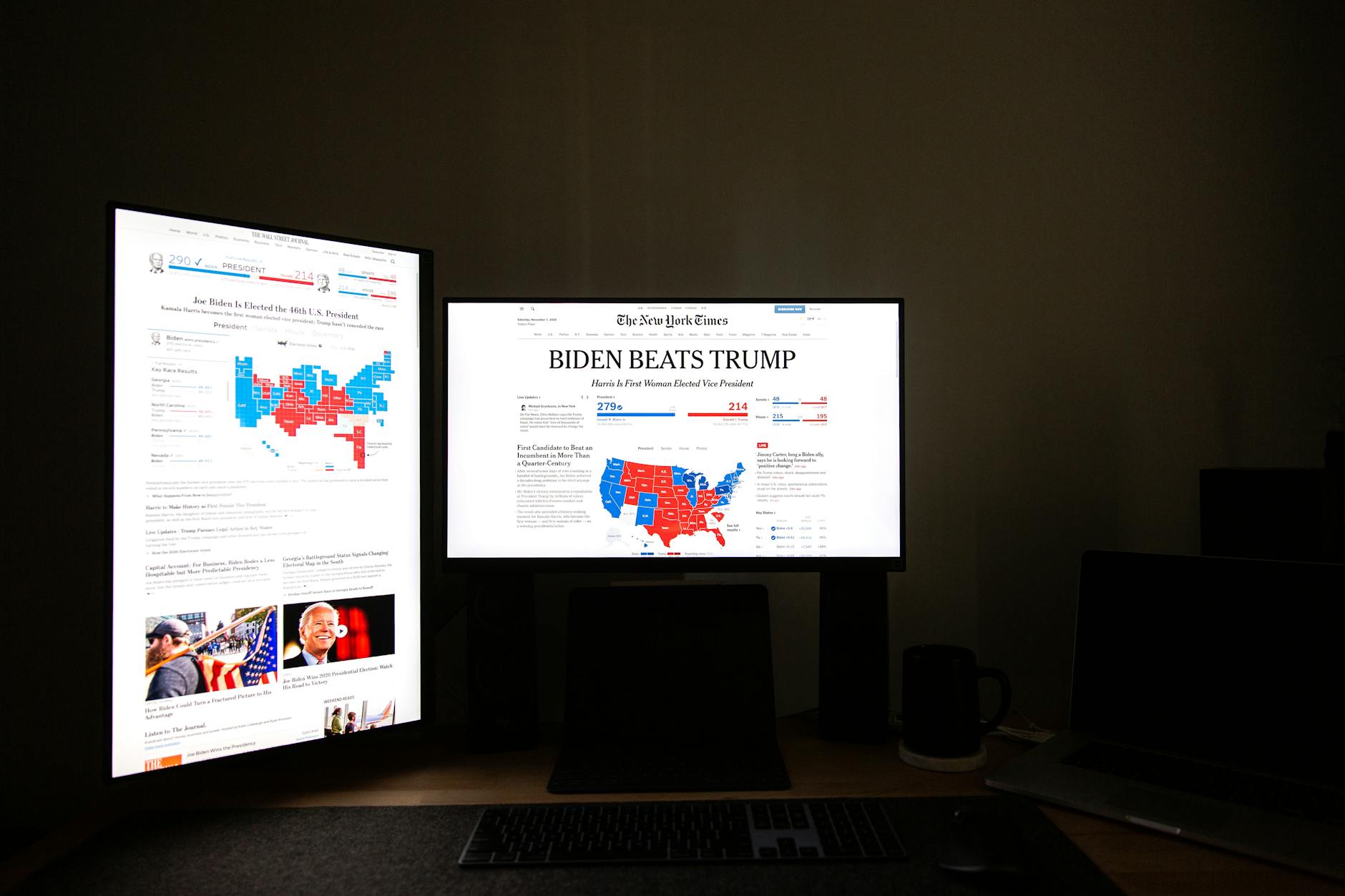
From a marketing theory perspective, blue evokes trust and openness and red evokes passion, anger, and excitement – a nod to the Right’s desire to maintain order and the status quo and the Left’s revolutionary history.
But today, we’d like to focus on the marketing strategies of the Russian political entities that emerged from the early 1900s and their clever use of branding to garner support in a time of famine, repression, and violence.
(Just to be clear, we’re not taking a political stance with this article. We just want to shed light on how political groups have cleverly used psychology and branding. This is not a commentary on the merits of communism or any other political ideology).
Lenin’s branding choice: Bolshevik vs Menshevik
We begin our exploration of Russian political marketing in 1903, when Vladimir Lenin and his band of revolutionaries decided to go by the name “Bolshevik.”
This change came about during a split in the Russian Social Democratic Labour Party (RSDLP).
The term “Bolshevik” essentially means “majority” in Russian, indicating their claim to being the dominant force in the party.
On the opposing side, led by Julius Martov, was the faction known as the “Mensheviks,” implying they were the smaller group.
Interestingly, the Bolsheviks were by no means the numerically superior faction – they simply possessed a knack for organisation and strategy that propelled them to prominence.
In these early beginnings, the Bolsheviks were outnumbered but by naming themselves as the “majority party” they cemented themselves as such in the eyes of the Russian people.
Along with Lenin’s iron-fisted leadership, one might argue that this clever branding strategy was a cornerstone of the eventual success of the party.
Lenin’s faction sought to portray themselves as the true representatives of the proletariat (the majority of Russian citizenry) within the broader political landscape.
Lenin clearly understood the consequences of good branding on a political – and, later, military – campaign.
Why is history such a powerful marketing strategy?
Russian political parties have always used their painful history as a brilliant marketing strategy.
Putin regularly relies on this in his addresses and responses to events across the world, citing his country’s engagement in World War One and the collective suffering that his people underwent at the hands of the KGB and Soviets.
Further back, Lenin did something similar – relying on a common hatred of the Tzar and regularly referring to opposition parties as being Tzar-like.
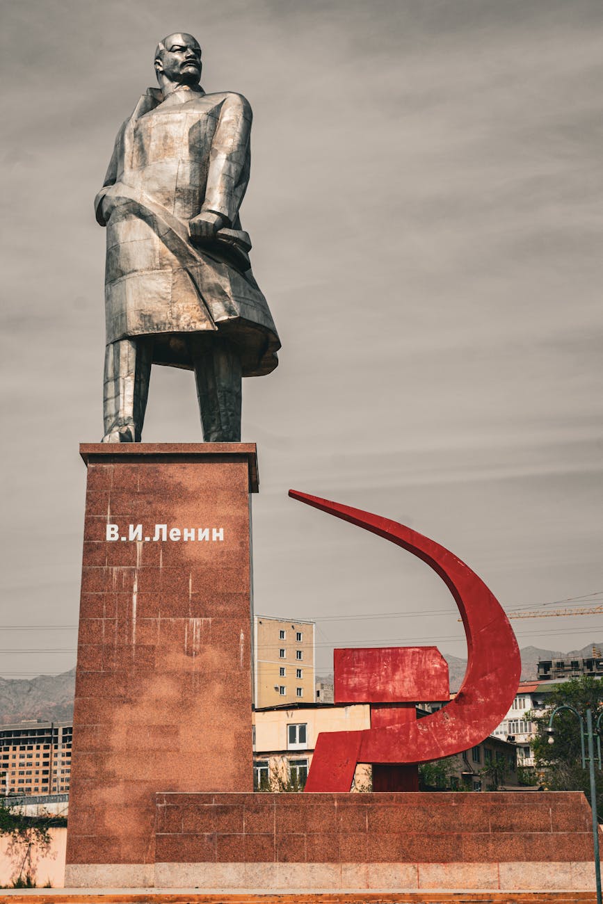
Travelling through post-communist states in Eastern Europe, one might be struck by the many statues that permeate the streets and provide a throw back to great victories, leaders and events.
It’s important to note that the Russian state has cherry-picked somewhat here, often using previous Tzarist-imperialistic policies to justify contemporary territorial claims and expansions.
History, it seems, can be used to justify many means.
As a marketer, one might not find history as such a powerful tool, but it nonetheless serves a purpose.
For example, if our client has been operating for many years, we can use this to demonstrate their experience and effectiveness in their field.
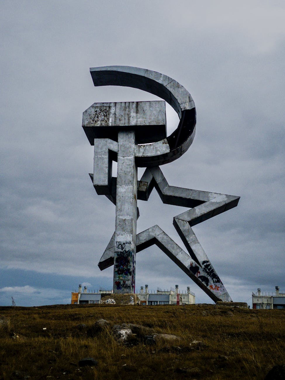
Why the hammer and sickle?
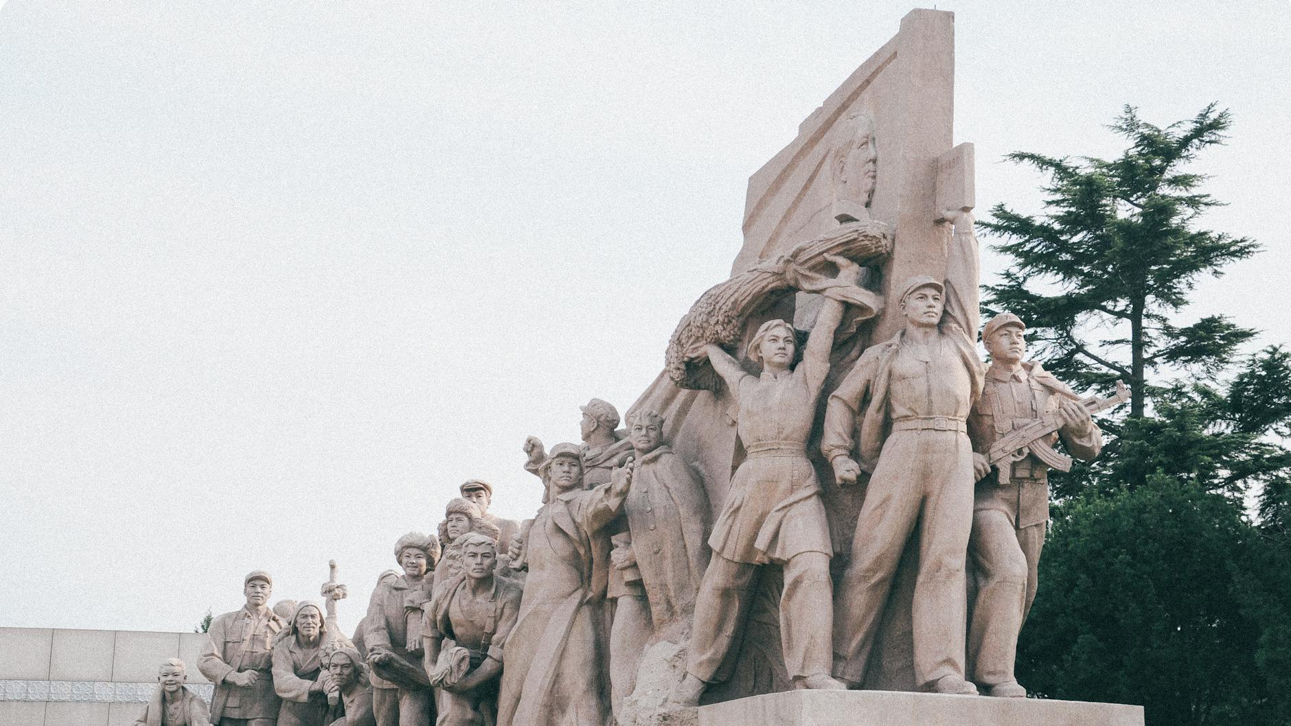
The famous hammer and sickle symbol emerged during the Russian Revolution of 1917 and became closely associated with the Bolshevik Party and later with the Soviet state.
The hammer and sickle represent the alliance between the industrial working class (symbolised by the hammer) and the agricultural peasantry (symbolised by the sickle) – two key segments of the population that were instrumental in the success of the revolution.
During the Soviet era, the hammer and sickle were common in propaganda imagery, public art, and cultural symbolism, reinforcing the ideals of socialism and communism.
(They were also widely used in other communist states and movements around the world as a symbol of solidarity and revolutionary struggle).
From a marketing perspective, the hammer and sickle can be seen as an incredibly effective branding tool, with its enduring power to captivate and mobilise masses of people to this day.
It’s important to remember that this branding was used at a time where many of the Russian people couldn’t read or write so whatever branding was used by the communists needed to be instantly accessible and comprehensible.
It also needed to reach a wide audience, transcending the linguistic and cultural barriers that reached from Moscow to Vladivostok, Siberia to Georgia – a Russian state with numerous languages, cultures, and peoples.
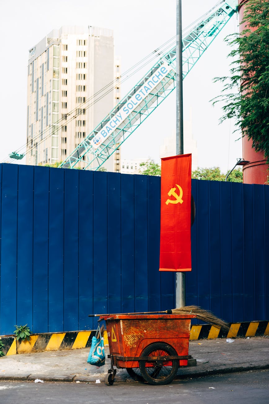
Don’t forget that on the red background (as mentioned above), the hammer and sickle was strongly tied in with those emotive feelings that the colour conveyed – anger, passion, and excitement.
Lessons to be learned for contemporary marketers
As modern marketers, we feel that the creation of emotion is the most important lesson to be learned here.
Yes, the above article primarily focuses on the political, but from a branding perspective the use of symbolism, the reliance on history and the choosing of vocabulary all go a long way to evoking a visceral response from our audience.
Like the hammer and sickle waving on a red banner, we can create an emotive, strong, and passionate response from our target market when we use the right techniques.
Simplicity, clarity, and accessibility in modern marketing – ensuring that our messaging cuts through the noise – should also be a key takeaway.
Storytelling was always a powerful strategy used by Russian political entities, but this was combined with a cutting brutality that was never open for interpretation.
Again, let’s just make it clear, we aren’t saying that everything that went on in Russian politics was a good thing.
The marketing used in Russia was often combined with brutal oppression and horrific crimes.
(It’s hard to argue that any of it was good, in fact – and we aren’t doing that here).
But there are lessons to be learned from the branding that surrounded Russian politics of the 1900s and that’s the important thing.
Political branding of any kind is interesting – it promotes us to think about how we can introduce this into consumer branding – which is what we hope we’ve done here.
If you’d like to read more absurd insights, please subscribe!
It’s FREE and grants you access to our subscriber only content as well as three FREE articles per week, delivered straight to your inbox.


Leave a comment