

I was on the tube the other day and, as I always do, I looked above the seats at the strip of adverts that ran along the roof of the carriage.
One took my eye.
It stood out to me, not for its flashy, brightly coloured design or even for the product or brand it was selling (I can’t actually recall what the ad was for), but for its density of copy.
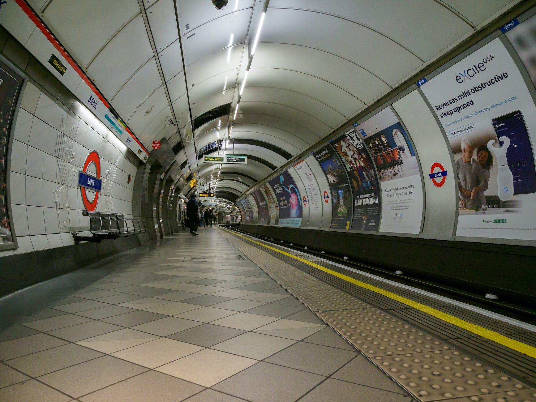
The number of words that the marketing team had crammed into the piece was, in many ways, startling.
Almost refreshing compared to the rest which mostly consist of a large picture and a small amount of text. Or a brightly coloured background and a single word like “Deliveroo,” “Uber,” etc.
It got my attention, but then I am probably disproportionately interested in these things.
As a copywriter, it’s my job to study ads like these, so it’s hardly surprising that I was drawn to this text-heavy, cumbersome, and boring piece.
For the average tube rider, however, it probably doesn’t work. Here’s why:
- The copywriter’s conflict with the graphic designer
- Why negative space works
- The peacock effect
- What’s my point?
The copywriter’s conflict with the graphic designer

Let me preface this by clarifying that I’m not a graphic designer. Cleverer and more talented people than me handle that within the agency in which I work.
However, as a copywriter and someone acutely interested in marketing, the study of negative space has always fascinated me.
It goes against everything we should believe as copywriters.
We should be stuffing as many persuasive arguments into our ads as possible – shouldn’t we?
We should be cursing these graphic designers, taking away our brilliantly written copy to just put pictures in, let alone when they fill it with empty space! How dare they!
That’s what I imagine a very arrogant copywriter might say anyhow.
In reality, negative space – the empty area around the subject image or text – is one of the best advertising strategies to appear in the last 100 years.
Why negative space works

Have you ever looked at old newspaper adverts?
They looked like articles, full of text and stuffing as much information on the product as possible into the smallest available space.
The marketing pros back then believed that words were the best persuasion tactic.
So, imagine what consumers thought when they saw a one-word article. Or an ad with only an illustration and a couple of carefully chosen words.
It showed the wealth of the company and the value of the product – the peacock effect.
Imagine a consumer thinking to themselves: “Wow! Adverts are expensive so they must have been confident in their product to advertise in such a way… which means it might be worth buying.”
By (seemingly) not making the most of the cost of the advert, the product itself if portrayed as much more valuable.
Think of all the luxury brand adverts you’ve seen recently – how many were a product picture surrounded with hundreds of words of copy?
I’m willing to bet they looked more like a single, central image of the product on a bright background with a title, subtitle and about three or four words of copy.
The peacock effect

Peacocks do this. They have huge, unwieldy feathers that make them easy prey but incredibly attractive to females.
“The peacock’s tail almost certainly reduces the male’s survival: the tail reduces manoeuvrability, powers of flight, and makes the bird more conspicuous; its growth must also impose an energetic cost.”
Why are they attractive to females? Because by deliberately weakening themselves – by making themselves more vulnerable – they are simultaneously saying: “Look how strong I was to begin with. Strong enough to be able to afford such fine feathers!”
Humans also.
You may have heard of “countersignalling” – showing off by not showing off.

“Many of the things that people and animals want to know about each other, such as toughness, cooperativeness or fertility, are not directly observable.
Instead, observable indicators of these unobservable properties must be used to communicate them to others. These are signals.
Countersignaling, by contrast, is showing off by not showing off, or by playing humble.
For instance, the new money are eager to flaunt their wealth, and often surround themselves with expensive luxury items.
Those with old money are more understated, preferring not to waste money on what they deem frivolities.”
The act of seeing a wealth indicator – a signal – as a frivolity is, in of itself, a wealth indicator.
The richest man I ever met walked around in ripped jeans and an old rugby top because he didn’t need to signal his wealth – it was beneath him!
What’s my point?
I apologise for the impromptu lesson on human evolutionary psychology but it highlights an important point.
Signalling the value of your product, as marketers, does not always need to come from direct signals – like copy.
Sometimes the background, the use of negative, empty space, where most would insert something else, is far more useful.
The key in this strategy is to signal your product’s value by downplaying how much you care about the cost of a petty advert.
For more marketing insights and access to subscriber only content, please subscribe below (it’s free!)


Leave a comment